All Access Tour
I designed the logo for Immuta's All Access Tour (a three-stop global roadshow across New York, Sydney, and London) and executed assets alongside the in-house team and external contractors. The brief drew from music tour culture and Sister Corita Kent. The resulting system deliberately broke from Immuta's primary brand to communicate access and exclusivity, spanning a brand kit, social templates, city-specific landing pages, email templates, signage, and eight motion assets.
John Carlson (Creative Direction), Cody Ben Lewis (Creative & Web), Matt Allen (Corporate Marketing), Heather Devane (Brand & Content), Peter Keough (Brand & Content), Alec Gannon (Video), Vivid Motion (Web)
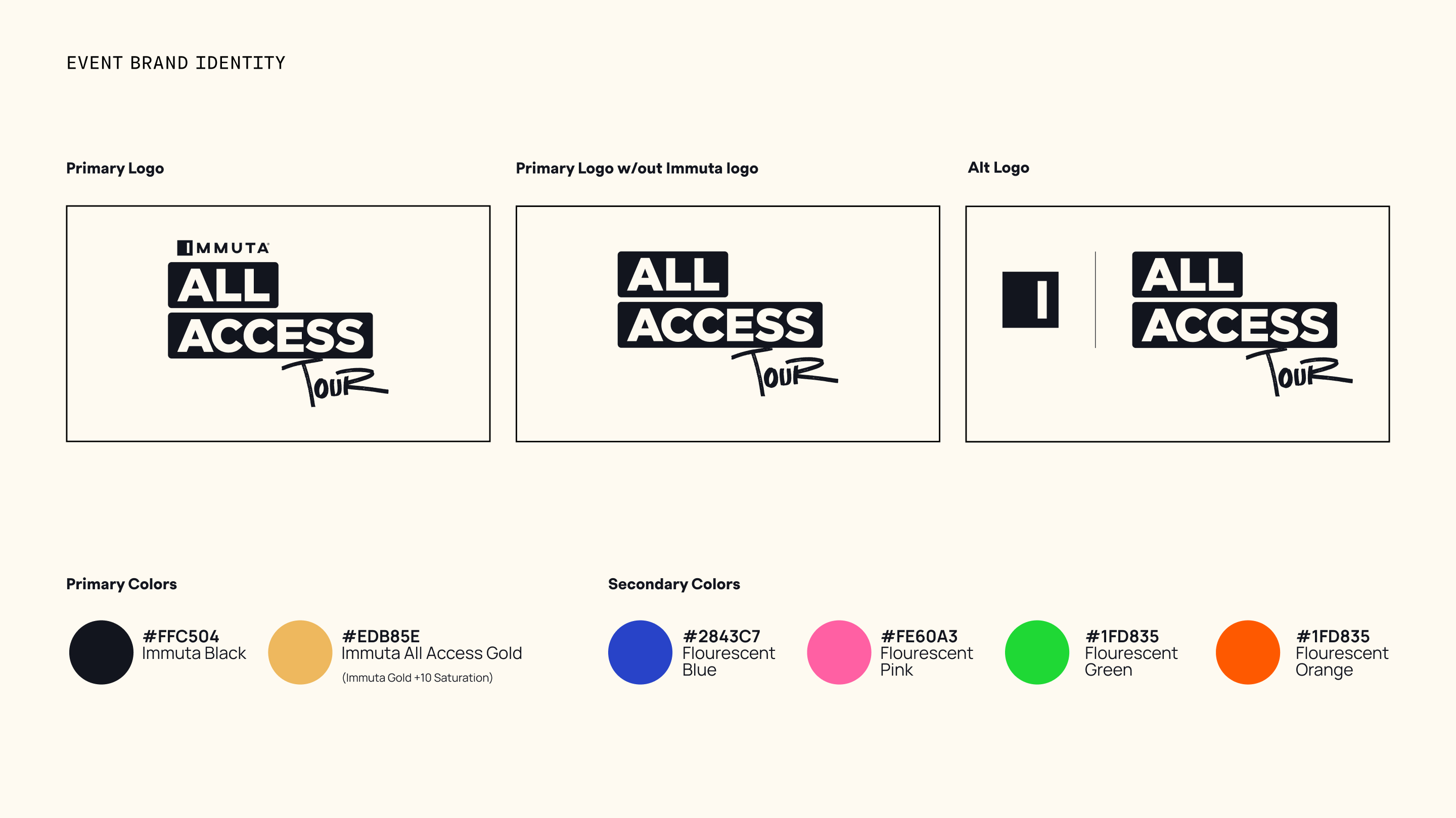


The creative brief was direct: draw from music tour and backstage pass culture. The visual reference given was Sister Corita Kent, expressive, graphic, screen-printed in feeling, alive. Identity decisions and creative direction were owned by the team.
- Logo: designed the AAT mark using stencil-influenced letterforms with a hand-crafted quality referencing screen printing and event poster design, built to feel like an unveiling rather than a polished corporate mark
- Asset execution: worked with the in-house team to produce the full creative suite, social card templates, email templates, city-specific landing pages, signage, and on-site promotional materials
- City flex: the system had to hold across New York, Sydney, and London, each with its own presence without fracturing the identity

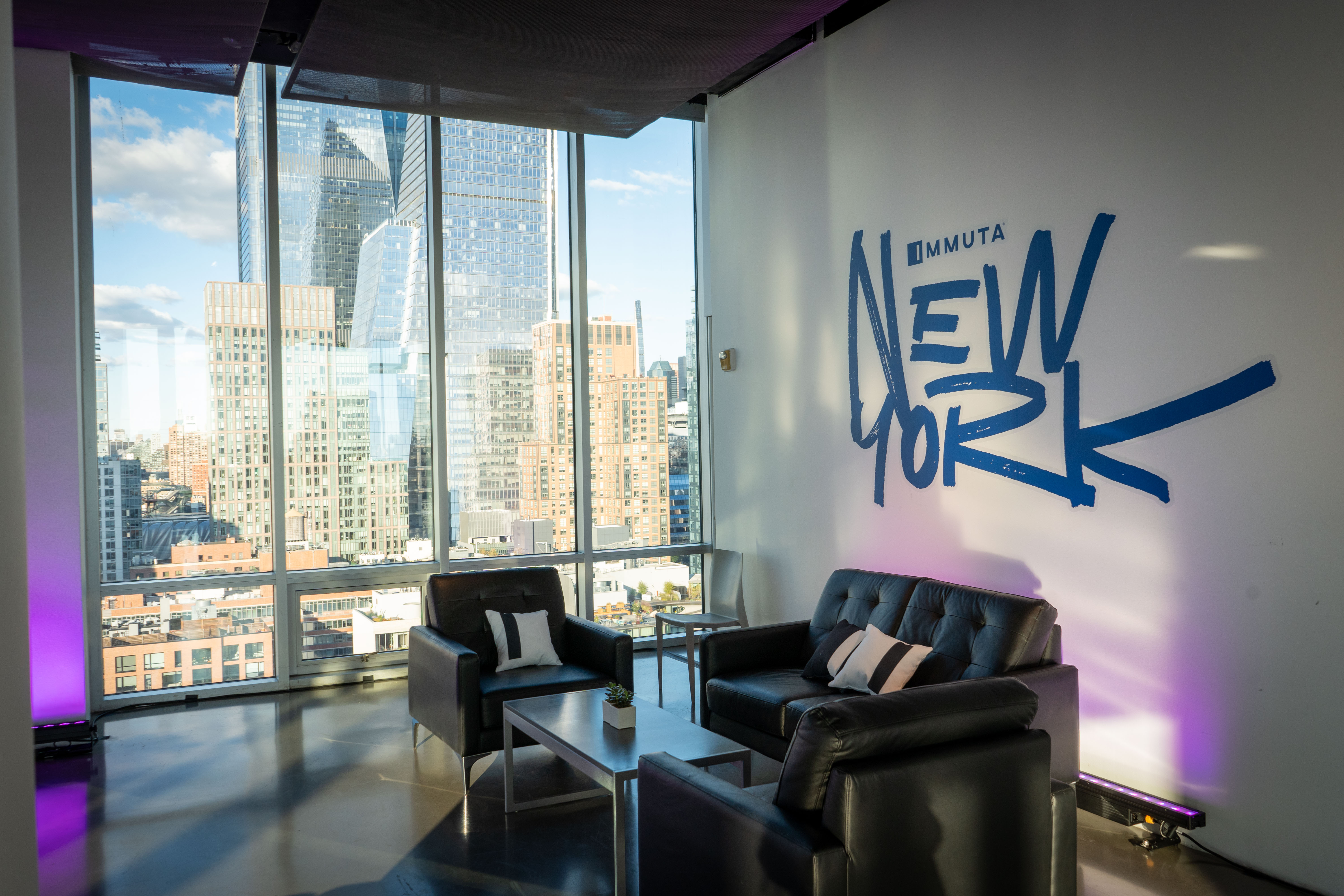


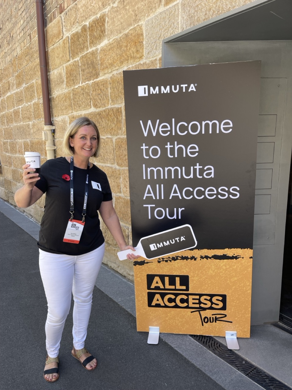


The All Access Tour ran across all three cities on schedule, with the sub-brand identity and asset system holding consistently from New York through Sydney and London without a rebuild at each stop. The city-specific adaptations (landing pages, social cards, motion graphics) carried the same visual DNA while giving each event its own presence.