Immuta Brand Evolution
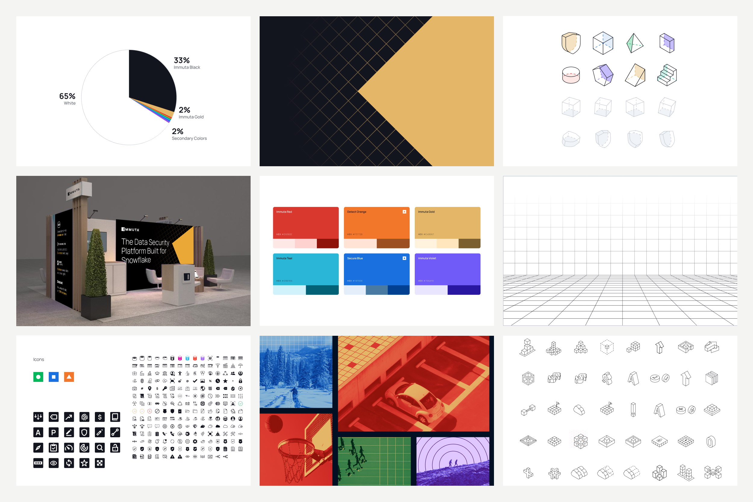
Immuta's brand had a scale problem. Every SaaS company reaches for the same visual language, and our CEO wanted Immuta to read as bigger and more established than it actually was. The old system, stark black-and-white contrast, a grid of 3D shapes, couldn't carry that weight. Too many elements competing, not enough room to grow.
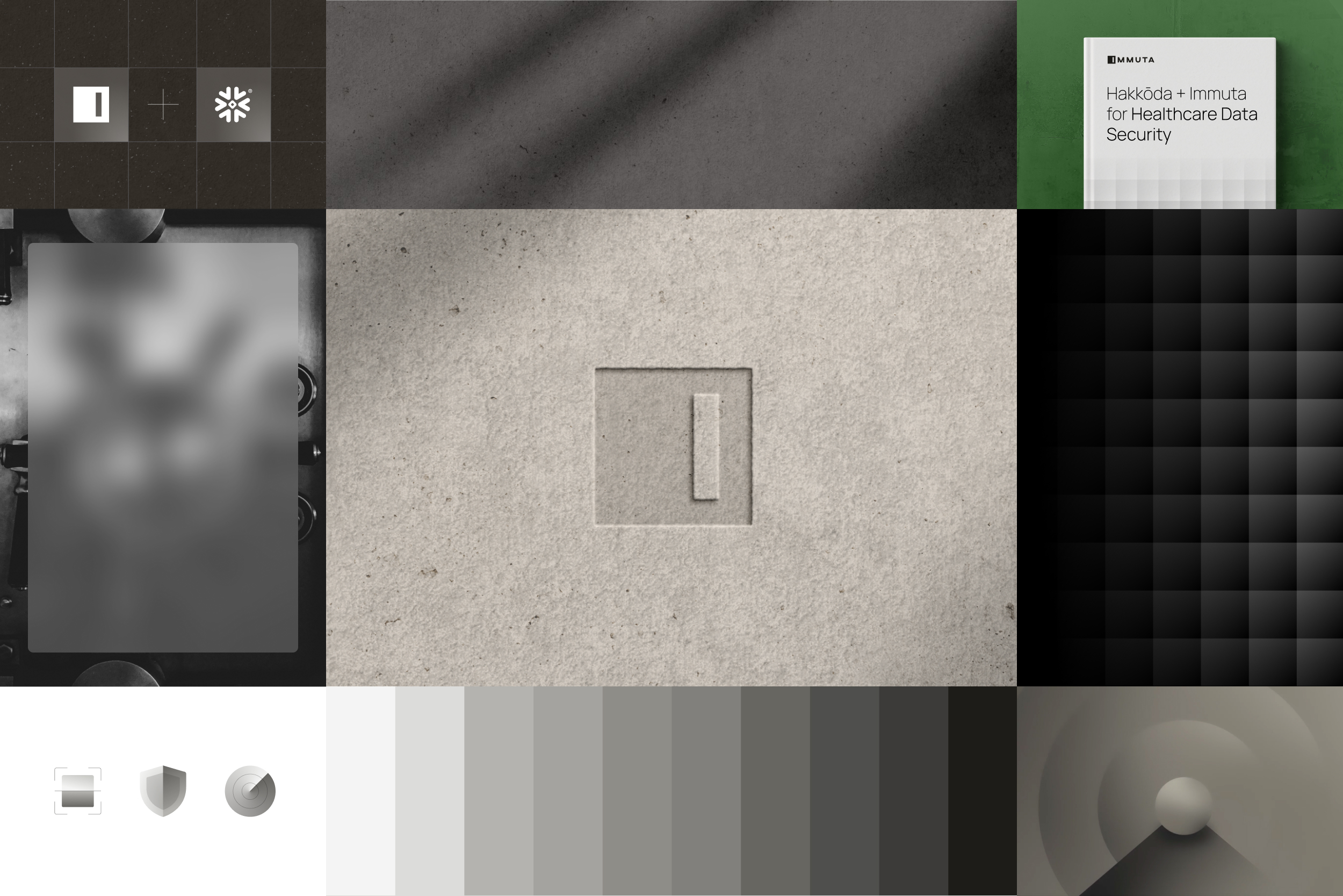
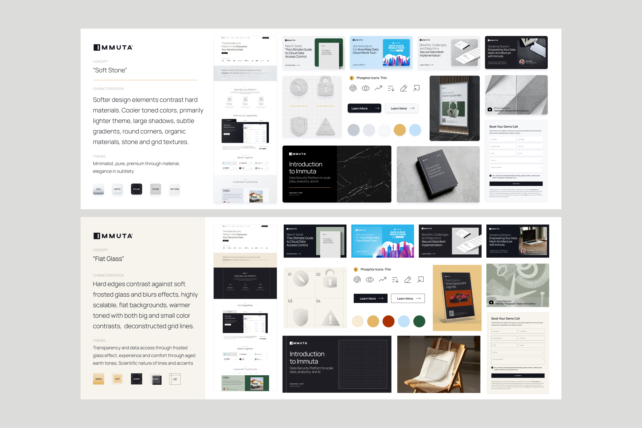
We researched how other brands, SaaS and otherwise, handled privacy and security visually, and kept circling back to a physical idea: privacy glass, the frosted glass used in offices to create privacy without closing off a space. Three directions came out of it:
- Flat Glass: soft, airy, minimal
- Dark/Light: built on hard contrast
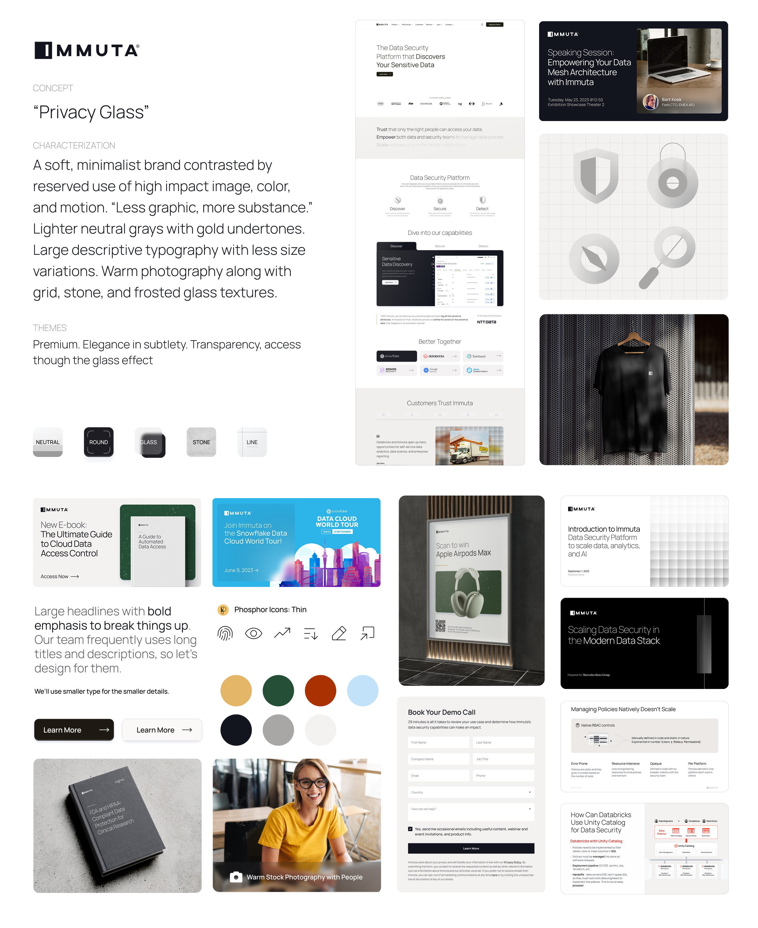
- Privacy Glass: we combined them, letting Dark/Light's contrast coexist with Flat Glass's softness, paired with a Sage archetype to guide tone.
The hardest part was the material language: bringing physical texture, stone, frosted glass, architectural surfaces, into a mostly digital product without it reading as literal or decorative. The guiding principle: less graphing, more substance.
Cody Ben Lewis (Creative & Web), Matt Allen (Corporate Marketing), Heather Devane (Brand & Content), Peter Keough (Brand & Content), Alec Gannon (Video), Vivid Motion (Web)
As part of Immuta's Corporate Marketing team, our biggest responsibility is the brand itself, owning visual identity, brand governance, and communications. My specific contributions:
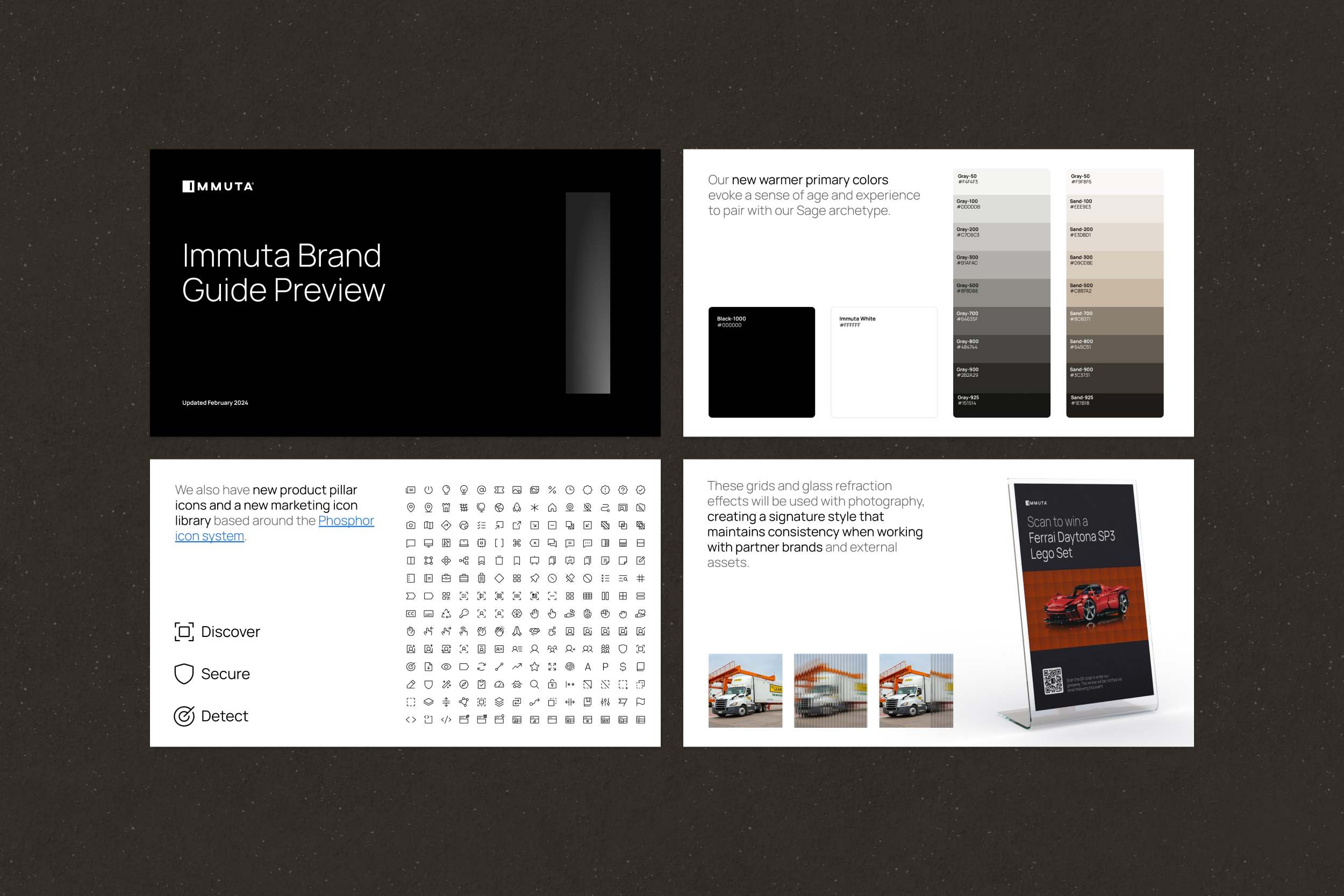
- Typography & iconography: built the type scale and icon system carrying Privacy Glass's tone
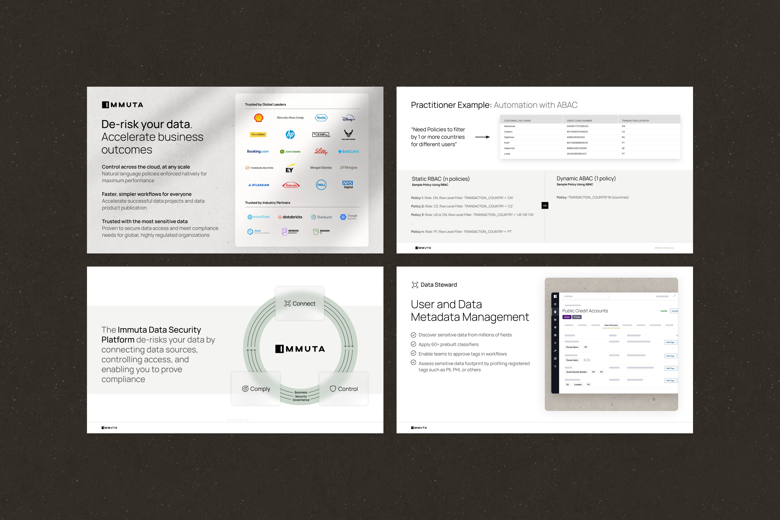
- Applied executions: an interim Brand Guide, a set of Slide Examples proving the system against real technical content, and a repeatable Deck Template
- Figma system: formalized the approved direction into a shared component library, a necessity once the whole team needed to build from it, not a separate initiative
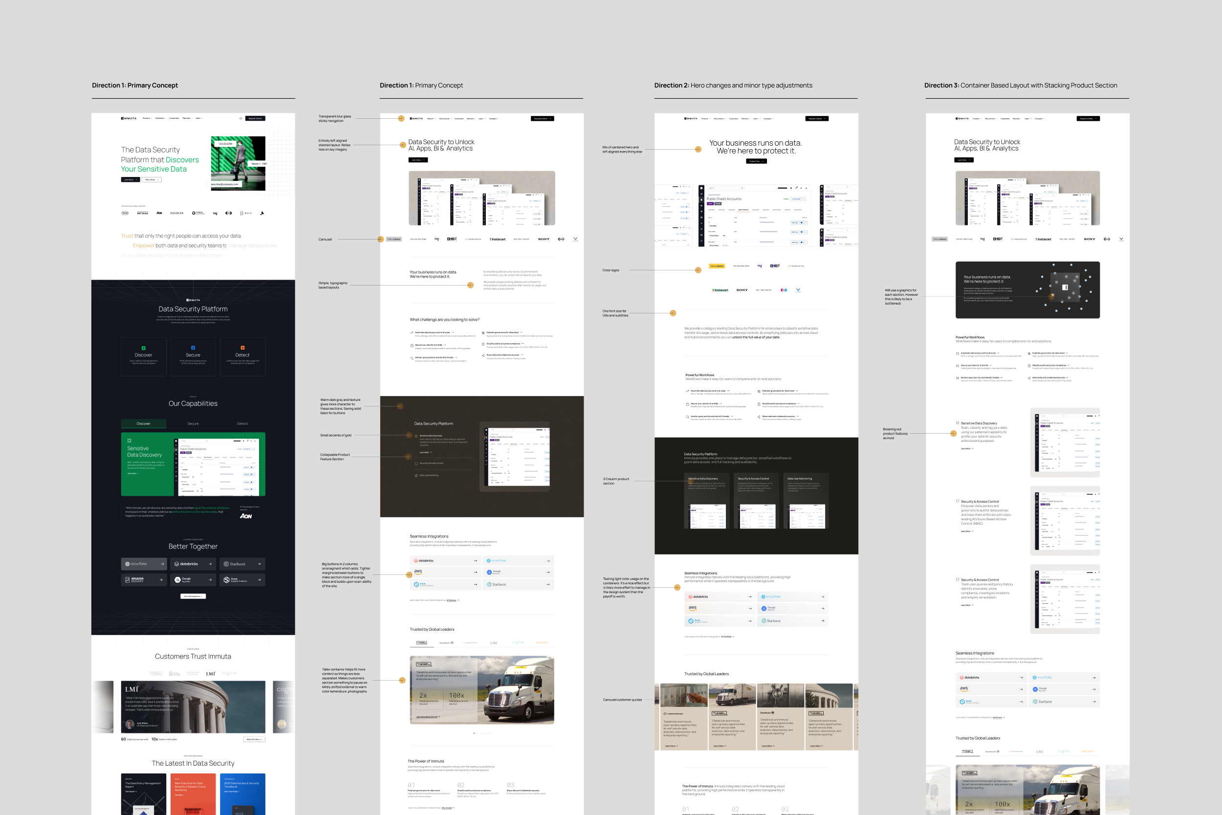
- Web exploration: extended the material language into early web treatments
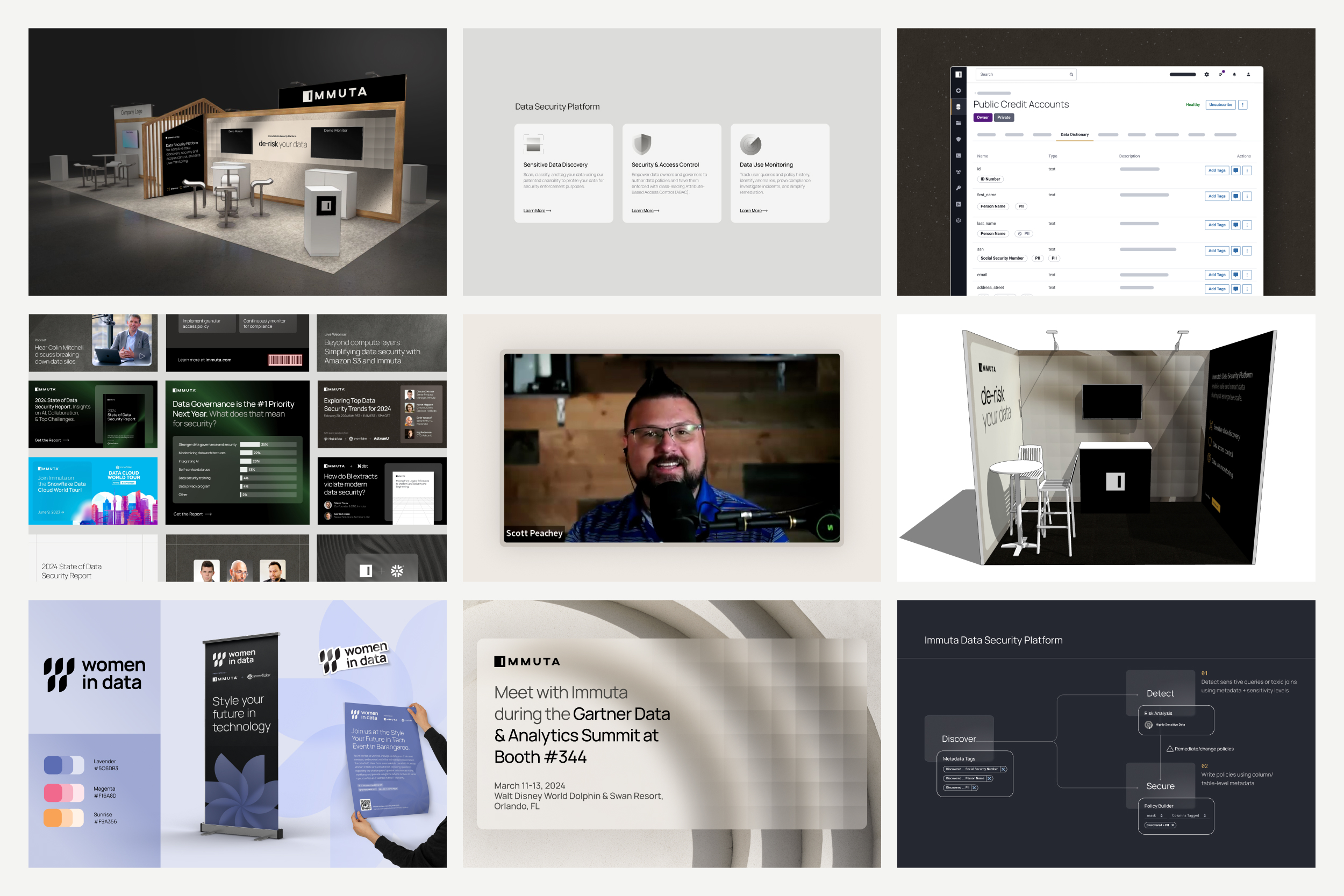
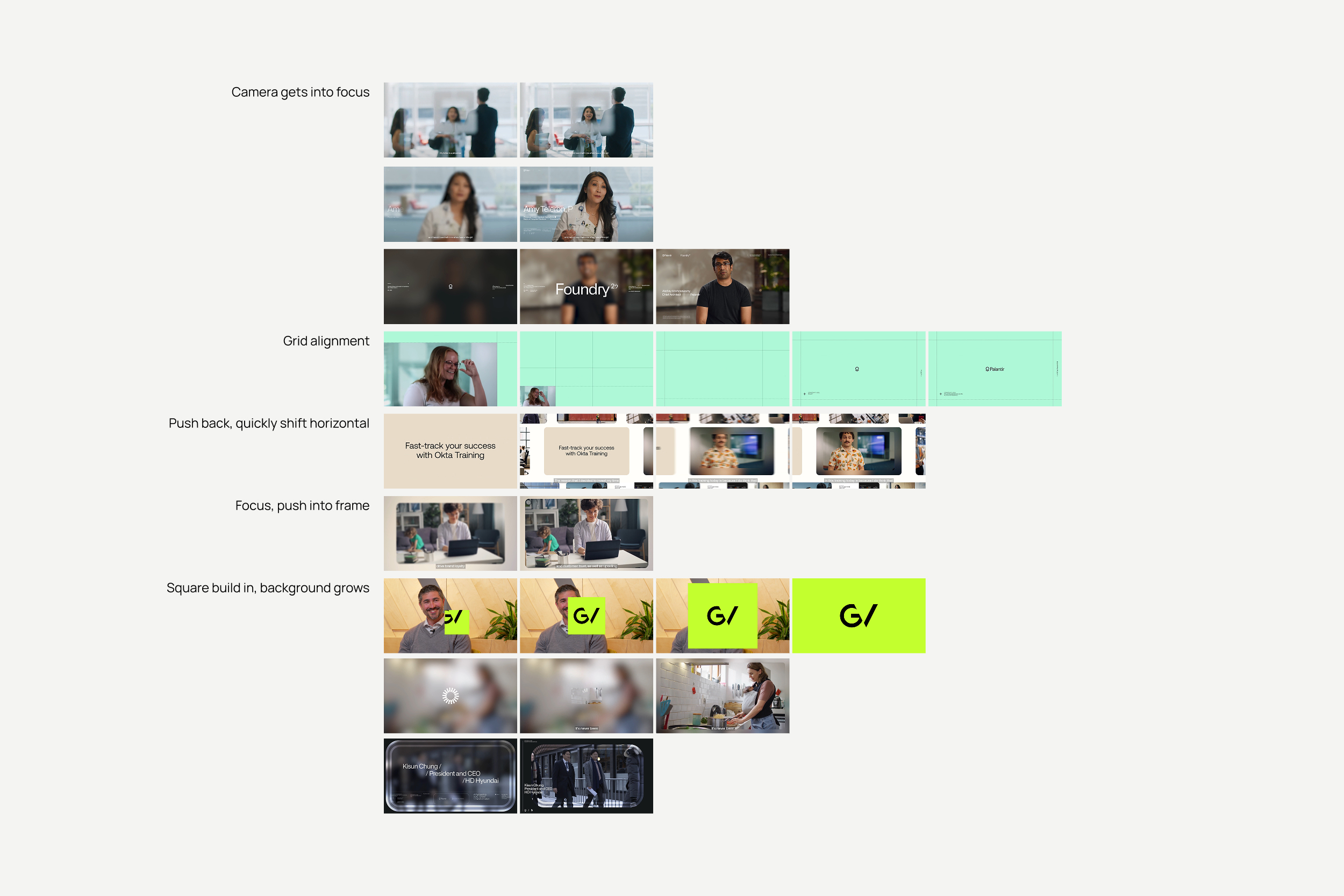
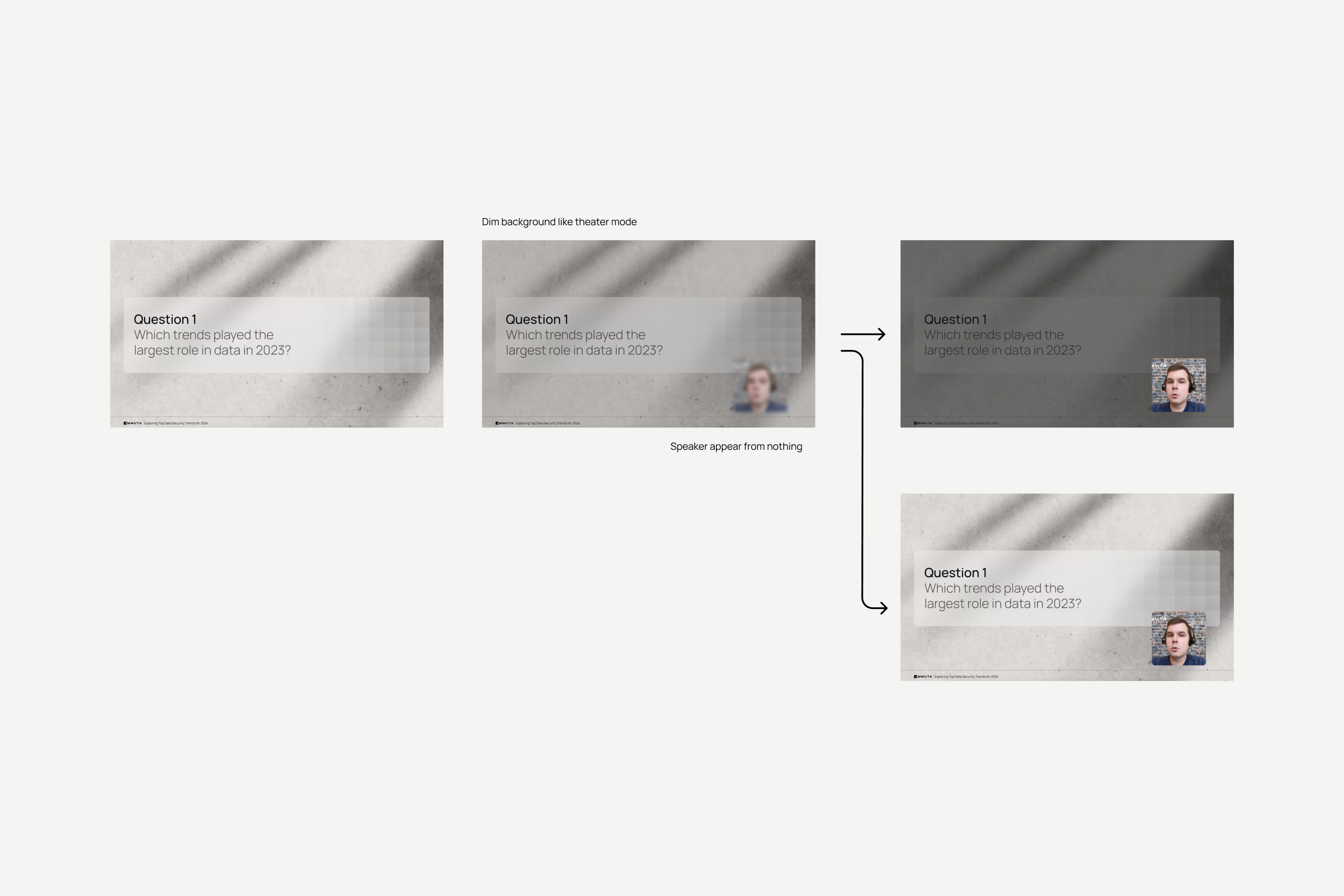
The last piece, and the one I owned outright, was translating Privacy Glass from something static and experiential into motion. How do you take the physical language of real glass, its shading, its layered translucency, and put it on screen?
Expanding the direction into a full Motion Kit was the biggest thing I defined on this project, Immuta's second iteration of a motion system, not the first.
- Components: logo idents, transitions, lower thirds
- Where it lives: demos, webinars, and brand films, the primary avenues where it gets used and amplified